Furniture planning guide
Specifying a Retro Palette for Hotel and Villa Lounges: Colour That Survives Production
Colour is easy in a photograph and difficult in a production run.
Colour decisions are usually made from the smallest evidence in a project: a screen image, a corner of fabric, a showroom visit under someone else's lighting. A retro palette raises the stakes because it uses colour deliberately — deep seating, orange and green in conversation. In a boutique hotel lounge or a villa living room, those colours then have to survive being produced piece by piece, possibly weeks apart, and still read as one palette when the room is finally assembled.
Client-project furniture and the making process, filmed in our Foshan showroom and workshop.
Retro-inspired seating, dining and room-colour references in showroom settings.
01
Fix the hierarchy before the hues.
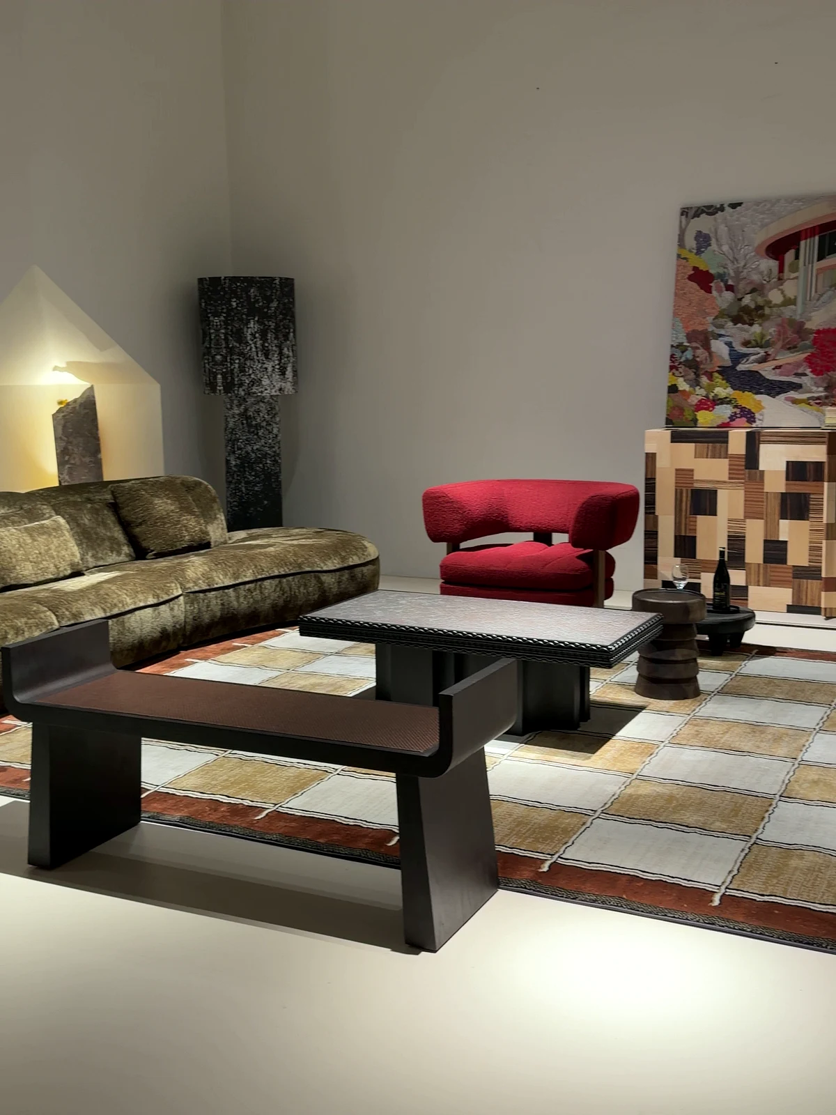
Identify which piece occupies the broadest part of the view — the sofa, a large cabinet, the rug — and decide whether its colour leads or forms the quiet base for smaller pieces. The deep-toned seating in the film is one possible lead; the existing floor and wall are part of the same decision. Judge the hierarchy from the entrance, where large blocks and silhouettes matter more than anything a close-up can show.
02
Every repeated colour needs a job, and a record.
A colour might connect two chairs, return in a cushion, or echo part of a rug. Choose where the repetition helps the room feel connected; it does not need to appear in every zone or in equal amounts. What it does need is a line in the room schedule stating where it appears — so that a later substitution, made under time pressure on one piece, shows up as a palette change rather than passing unnoticed until the room is assembled.
03
Approve colour on physical samples, in the project's own light.
The camera and grading shape what the film shows; two colours that agree on screen may part company in the room. Shortlist relationships from the film, then approve the actual colours on physical samples, checked in the daylight and the evening lighting of the room they are for. File each approved sample's identifier with the pieces it governs — that small record is what a later production run is checked against.

04
The table between two colours is part of the palette.
The orange and green grouping in the film works as a relationship, not as two independent choices — and the tabletop, base and nearby cabinet sit inside that relationship. A strongly patterned top behaves like another active colour element even when its dominant tone is subdued. Test seating colours with the actual table and cabinet surfaces between them, in the positions the room schedule assigns.

05
Keep the room working while it looks collected.
Draw the actual footprints and test the routes through the seating group. A lounge can look collected without an object in every gap, and access to doors, drawers and everyday seats outranks a completed palette. If one more colour requires an awkward piece standing in a route, the palette changes — not the circulation.
Your planning checklist.
Bring these details into the conversation.
- Palette hierarchy recorded: lead colour, repeated accents, quiet pieces
- A schedule line for every place each colour appears
- Physical samples approved under the room's own lighting
- Sample identifiers filed with the pieces they govern
FOSHANPICK
A clearer brief. A better starting point.
FoshanPick is a furniture manufacturer with our own factory in Foshan. We design and make sofas, beds, dining tables and cabinetry for hotel, apartment and villa furniture projects, with quality control and export services. Share your plans, quantities and destination so we can confirm the furniture scope for your project.
Share your project briefBefore you choose.
Can the film's colours simply be matched from the screen?
No. The film is lit, graded and compressed; it can select relationships but cannot carry colour values. Colour is approved on physical samples, and the film's role ends at shortlisting which relationships to test.
Sources and further reading
These references support the planning questions in this guide. They do not identify the materials, mechanisms or specifications of the furniture filmed here.
Start with your project list
Send your room list, drawings or reference photos to discuss custom furniture options and a quotation.